Data Centers
Businesswoman standing in data center..jpg?width=700&auto=webp&quality=80&disable=upscale)
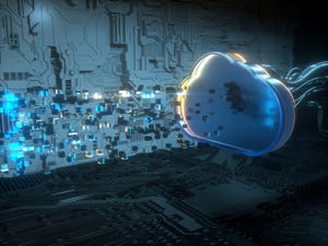
IT InfrastructureGPUs Force CIOs to Rethink the DatacenterGPUs Force CIOs to Rethink the Datacenter
A growing reliance on graphical processing units (GPUs) is changing datacenter dynamics.


.jpg?width=300&auto=webp&quality=80&disable=upscale "ladders leading up to dark clouds")


Editor's Choice


May 2, 2024
While there are plentiful options in cyber resiliency and business continuity tools and platforms, there isn’t one that can knock out everything from sudden cloud outages to prolonged ransomware attacks in a single punch. What can you do to keep the company on its feet no matter what is thrown at it? Find out in this new virtual event.
Reserve Your Seat NowNever Miss a Beat: Get a snapshot of the issues affecting the IT industry straight to your inbox.