

Never Miss a Beat: Get a snapshot of the issues affecting the IT industry straight to your inbox.
A data-driven real estate application helps people find homes that are within a short commute to jobs that they might like.
5 Min Read
“Location, location, location.” That’s the mantra of the real estate profession. It sounds simple enough, but the question is what is one looking for to identify a desirable location? Now data analytics can provide a clear answer for at least one type of market: those who seek homes within commuting distance of jobs that provide a living wage.

Credit: Pixabay
Opportunity Score is a data-driven tool built by the real estate company Redfin in partnership with the White House Opportunity Project. It identifies which residential areas offer affordable housing and are within a 30 minute carless commute of jobs that pay at least $40K a year.
In its blog, Redfin explained what went into powering Opportunity Score. It works off another data tool Redfin put out, Walk Score, which provides the Travel Time API as well as rental costs. Redfin added in its own data on home prices. Additional data from government sources is added in: jobs data from the U.S. Department of Commerce and population data from the U.S. Census. The target of $40K was selected because it was “the highest pay tier” that worked to filter for in the jobs data from the Department of Commerce,
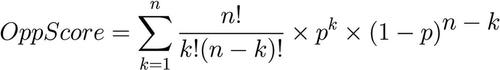
Redfin makes no secret of how it arrived at the scores but shares the formula it used:
We call the transit accessible jobs ‘n’ and we use it in our recipe to get the Opportunity Score for an address. The other big ingredient is the letter ‘p’ and it’s proportional to the inverse of the population in the greater area. We combine ‘n’ and ‘p’ to get a score.
That formula was then applied to “millions of addresses in hundreds of cities,” to form the basis of the Opportunity Score for cities across America.
Considering a move, or just curious about how your own city ranks? You can plug it in to get the score. Just don’t expect to find a perfect 100. As Redfin explains, a city can start out with the 100 because of the number of jobs that meet the criteria, but then be knocked down due to the home prices. There’s also quite a difference between scores for cities in general and addresses in particular.
The highest score it assigned to a city is a 70, and that went to San Jose where 78% of jobs meet the criteria. But that’s not the only thing that counts. The same job percentage was found in Detroit, the city with the lowest score -- just 3%. Individual addresses around Detroit, though can reflect very high scores, with, for example, one address on Harrison Street earning the description “Job Seeker's Paradise” with a score of 94.
You don’t have to just select addresses at random to identify which get that top rank or the next level of “Good Job Accessibility” or the lower “Some Job Accessibility” or “Limited Job Accessibility.” All that is represented by the colors on the map. The greener it is, the better it is for workers. Scores fall as it turns yellow and then orange.
I checked out my own Long Island neighborhood and found, not too surprisingly, that it is near the lower end with a score of 14. This put it into the “Limited Job Accessibility” rank, which merits the rather grim description, “You’re unlikely to get to work in 30 minutes, with or without a car.” That’s quite true and probably not that unusual for a suburban setting.
Though there is access to a train, the commute to the city takes longer than half an hour. The jobs within the neighborhood itself or within the reach of the buses tend to be lower paying, typically about $10 an hour. That is not really a living wage for a family in which teenagers get paid that amount and even more just for babysitting.
That doesn’t mean there are no jobs at all that pay that rate nearby, just rather slim pickings. The site offers a bar graph to visualize the percentage breakdown of the top categories for jobs that do exist within a 30 minute carless commute for my neighborhood:
Health Care and Social Assistance 23% (we do have quite a few doctor and dentist offices in the area).
Transportation and Warehousing 21%
Retail Trade 9%
Administrative and Support and Waste Management and Remediation (rather an eclectic mix to put together, but there you go) 7%
The home price data strikes me as a bit off, especially the huge jump it shows between a 2 and 3 bedroom properties that it shows for a purchase: from $289K to $629K. There are 3 bedroom houses selling for less; that price should really cover a 4 bedroom home. Also it doesn’t quite fit with the corresponding rental prices that remain the same for 2 or 3 bedrooms: $2.5K. But you don’t have to wonder how Redfin arrives at its figures, it offers links to the listings it uses.
I checked it out and found the cause of the discrepancy between my view of the market and the one presented on the site. The house average is based on only 3 houses, one of which is asking $899K (in their dreams) which makes the $629K price look like the median. For rentals, Redfin draws on a much larger sampling, but that is in part because it includes properties in nearby neighborhoods with lower price points, even going into Queens, which does generally have lower rents than Nassau County.
Bearing all that in mind, you may have to do additional research to get a more accurate picture of what your housing will cost in a particular area. You also will have to do additional research to find out just what jobs are available. Redfin merely gives you the categories but not direct links to openings. It only does that for the real estate listings because that is its business.
Despite those shortcomings, it is a handy tool for someone who wants to make such a data-driven decision about where to look for a home. Then they can feel perfectly complacent when they ride the bus or walk home from work and see one of those signs that say, “If you lived here, you’d be home now.”
About the Author(s)
You May Also Like
More Insights
Editor's Choice


May 2, 2024
While there are plentiful options in cyber resiliency and business continuity tools and platforms, there isn’t one that can knock out everything from sudden cloud outages to prolonged ransomware attacks in a single punch. What can you do to keep the company on its feet no matter what is thrown at it? Find out in this new virtual event.
Reserve Your Seat Now