Mailbox's elegant approach, simple design, and system of swipes that handle email and task management make this app worth trying for everyone who uses Gmail on their iPhone. For someone who lives in their inbox, and uses email to manage tasks this may well be the best app to date. The UI is sophisticated and easy to use, as is email composition and reading. But, its long waiting list and exclusive Gmail-iPhone compatibility will exclude some iPhone users from trying the new app out.

Mailbox is an email app for iPhone and Gmail that re-imagines the way we ingest and task-manage our inboxes. It's more than simply a nice-looking email client, as it aims to take a streamlined, efficient approach to handling the large volume of email most of us are accustomed to receiving every day. The management features — the main reason to use this app, in my opinion — outstrip Apple, and even Google's Gmail app, especially in terms of ease of use.
This review includes several short videos demonstrating the features of Mailbox. You decide if it's so much better than Gmail and Apple Mail that it's worth waiting for.
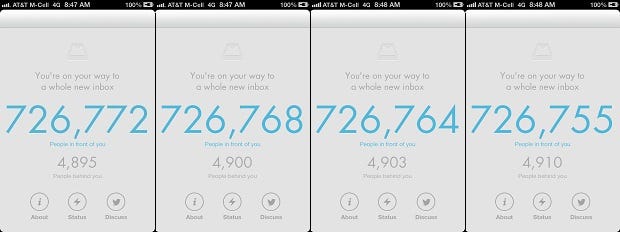
Mailbox has received some recent press because of an unusual launch strategy: a waiting list. That's right, in order to use the app hopeful Mailbox users will have to wait in line. And it's a long one. After downloading the app, available free in the App Store, I found I was well over the 700,000th person in line — a number that came without any real indication about when I'd actually be able to download the software.

Mailbox app waiting list countdown
The company has reasons for adopting the unusual marketing tactic, and it's certainly generated press, which never hurts a startup, but I'm skeptical about the approach and whether it will get people excited, or turn them away. Regardless of marketing hype, Mailbox's launch, a gradual roll out, is a pretty common approach for startup companies – and recalls Gmail's invite-only launch.
Mailbox Videos:
The marketing worked on me to a certain extent. I was actually excited to get my hands on the app — something I can't say for most email software — and once I did Mailbox did not disappoint. In case you're wondering how I moved up so quickly in line, I asked Mailbox's PR person for a copy of the app. One of the perks of being a tech reporter. On first launch the app presented a short tutorial that demonstrated how the swipes used to manage email work. The UI is clear, easy to read, intuitive and rivals Google's Gmail app for iOS, which I reviewed earlier this year. With almost no instruction I was able to figure out most of the app, and in just a few minutes I was up and clearing my inbox.
Mailbox's system of swipes is clever. When I viewed a list of email messages — inbox, archives, etc. — I had a choice between four possible swipes for each message: half way to the right, half way to the left, and a full swipe right or left. Each option presented a choice about how to handle emails.
Handling email was the most interesting and useful part of the application. The app gave me four choices about how to deal with messages in my inbox: delete, archive, schedule later and add to a list. While the first two are common, it's the last two that give Mailbox an edge over the competition. The schedule for later, a half swipe to the left, offered me eight options, including later today, this evening, next week, a specific day or just "someday." Once deferred the app moves the message into the later folder — accessible from the navigation bar — and notified me via a device alert when it was time to deal with an email. In the settings Mailbox allowed me to customize all of the "schedule later" snooze preferences – for example, allowing "later today" to be six hours from now, instead of the default three.
Lists work much the same way as scheduling. Swiping a message to the far left brings up a choice of lists like "to do" and "to read." The app also allowed me to create a new list.
The email composition part of the app was what I've come to expect from iPhone email software. For short, simple messages — the kind most people send on their iPhones — it's perfectly fine. There's nothing really imaginative about it, but that's OK. It works. Mailbox also features image attachments that can come from either the iPhone's image gallery, or the option to take a new image with the iPhone's camera, something that sets it apart from Apple and Google's email app offerings.
The app's most significant downside was that it only works for people who own an iPhone and use Gmail as their email service. While it's possible to have non-Gmail accounts forward to single Gmail account, not everyone, for various reasons, will be willing to do that. A Mailbox spokesperson told BYTE the company plans to add additional devices and email providers in the future; they wouldn't share details or specifics. My only other knock against the app was the search feature — it's a bit unwieldy, and doesn't compete with the Gmail app's search.
Name: Mailbox
Mailbox's sophisticated approach, simple design, and system of swipes that handle email and task management make this app worth trying for anyone who uses Gmail on their iPhone. For someone who lives in their inbox, and uses email to manage tasks this may well be the best app to date. The UI is elegant, and easy to use, as is email composition and reading. But, its long waiting list and exclusive Gmail-iPhone compatibility will exclude some iPhone users from trying the new app out.
Price: Free
Pros:
Elegant, intuitive UI works well on iPhone.
Successful combination of task-management, and email handling.
Swipes make inbox processing much more efficient on the iPhone.
Cons:
Long waiting list.
Only available for iPhone and Gmail.
Search function could use some work.
Next Page: Typing a message in Mailbox (video)
The email composition part of the app was what I've come to expect from iPhone email software. For short, simple messages — the kind most people send on their iPhones — it's perfectly fine. There's nothing really imaginative about it, but that's OK. It works. Mailbox also features image attachments that can come from either the iPhone's image gallery, or the option to take a new image with the iPhone's camera, something that sets it apart from Apple and Google's email app offerings.
Mailbox's system of swipes is clever. When I viewed a list of email messages — inbox, archives, etc. — I had a choice between four possible swipes for each message: half way to the right, half way to the left, and a full swipe right or left. Each option presented a choice about how to handle emails.
Handling email was the most interesting and useful part of the application. For messages in my inbox the app gave me four choices about how to deal with them: delete, archive, schedule later and add to a list. While the first two are common, it's the last two that give Mailbox an edge over the competition. The schedule for later, a half swipe to the left, offered me eight options, including later today, this evening, next week, a specific day, or just "someday." Once deferred the app moves the message into the later folder — accessible from the navigation bar — and notified me a device alert when it was time to deal with an email. In the settings Mailbox allowed me to customize all of the "schedule later" snooze preferences– for example, allowing "later today" to be six hours from now, instead of the default three.
About the Author(s)
You May Also Like


