

Never Miss a Beat: Get a snapshot of the issues affecting the IT industry straight to your inbox.
Why do we quickly comprehend some forms of data presentation, and not others? The answer is vital to designers of decision-support applications. This installment of our series connects insight into the process of vision with presentation best practices.
12 Min Read

Business intelligence software alone doesn't enable you to make sense of data and effectively present it to others. Working with information to understand it, determine what should be done about it, and effectively communicate that message to others requires more than knowing where to click with the mouse. Business graphs and, to a lesser degree, tables of data communicate visually. The degree to which your data presentation effectively and efficiently communicates depends on how well you tap into the power of visual perception. To do that, you must know something about visual perception: what works, what doesn't, and why. Just making a graph pretty isn't doing your job. You need to paint a clear and powerful picture that makes people sit up, take notice, and say "Ah ha!"
Whenever I'm asked to describe myself, whether professionally or in general, one of the first terms that come to mind is "teacher." Part of what drives me at a core level is a desire to help people learn so that their lives are enriched with important new information and skills. This trait is intimately related to another that also fundamentally defines me: I am a "learner." I love to understand things. I don't just want facts; I want explanations. How does it work? Why does this work, and that doesn't? What is it about this that makes it stand out from the others? I believe that most people perform better at their jobs, even jobs that are seemingly mundane, when they understand what works, what doesn't, and why. This is especially true for knowledge workers.
Better than anyone else that I've encountered in my work, Colin Ware explains how visual perception works and how it applies to data presentation. In the preface to his book, Information Visualization: Perception for Design, he explains why he believes it is important to understand visual perception:
"Why should we be interested in visualization? Because the human visual system is a pattern seeker of enormous power and subtlety. The eye and the visual cortex of the brain form a massively parallel processor that provides the highest-bandwidth channel into human cognitive centers. At higher levels of processing, perception and cognition are closely interrelated, which is the reason why the words "understanding" and "seeing" are synonymous. However, the visual system has its own rules. We can easily see patterns presented in certain ways, but if they are presented in other ways, they become invisible.... If we can understand how perception works, our knowledge can be translated into rules for displaying information. Following perception-based rules, we can present our data in such a way that the important and informative patterns stand out. If we disobey the rules, our data will be incomprehensible or misleading."
When compared to our other senses (hearing, smell, taste, and touch), which are like narrow alleyways paved in cobblestones, vision is like a superhighway.
From Light to Thought
Figure 1 provides a visual representation of the primary components of visual perception. We don't actually see physical objects; we see light, either emitted by objects or reflected off of their surfaces. This light enters our eyes through an opening in the iris called the pupil. When we focus directly on objects, the emitted or reflected light shines on a small area on the retina at the back of the eye called the fovea. The retina consists of millions of light receptors, subdivided into two basic types, rods and cones. Rods sense dim light and record what they detect in black and white. Cones sense brighter light and record what they detect in color.
Cones are further subdivided into three types, each of which detects a different range of the color spectrum: roughly blue, green, and red. The fovea is simply an area with an extremely dense collection of cones. As a result, light that shines on the fovea can be seen in extremely fine detail. We're capable of seeing up to 625 separate data points in a one-inch square area, such as a dense collection of dots in a scatter plot. Perception of visual stimuli detected by parts of the retina other than the fovea is much less detailed, but it's capable of simultaneously processing vast amounts of information throughout one's span of vision, ready to notice a point of interest that invites greater attention (for example, the peripheral approach of a speeding car), which then leads to a quick shift in one's gaze to that area of interest. Rods and cones translate what they detect into electrochemical signals and pass them on, through the optic nerve, to the brain where they can be processed. Our eyes sense visual stimuli, then our brains perceive that data, making sense of it.
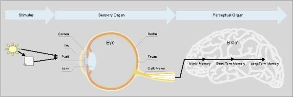
FIGURE 1 - Diagram of the visual perception system. (Eye and brain graphics created by Keith Stevenson.)
Role and Limitations of Memory
Just like computers, our brains use various types of storage to hold information while it's being processed and, in some cases, to store it for later use. There are three fundamental types of memory in the brain: iconic, short-term, and long-term. Iconic memory is similar to the graphics buffer of a computer, for it briefly stores what the eyes see until it is either moved into short-term memory (also known as working memory) for conscious processing or is discarded as nonessential. Short-term memory is like random access memory (RAM) in a computer: readily accessible for high-speed processing but limited in capacity. Information that's deemed worthwhile for later use is moved from short-term memory into long-term memory where it's stored and indexed in one or more ways for future retrieval, just like on a permanent storage device of a computer (for example, a hard disk). Despite a common misconception, we don't retain memories of everything we experience in life. Long-term memory is limited in its capacity, but amazing in its flexibility. It maintains and constantly rearranges a complex network of links between memories in an effort to keep memories available and optimally useful.
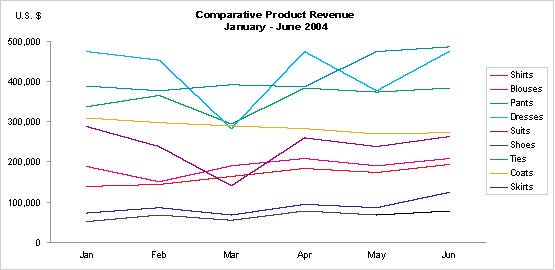
FIGURE 2 - Example of a graph that exceeds the limits fo short-term memory.
Short-term memory is where the real work of sense-making is done. New data is passed in from the world through the senses and old data is swapped in from long-term memory, working much faster than the conscious speed of thought to help us make sense of the world. Given our extraordinary cognitive abilities, it's incredible that all of this is achieved using short-term memory that can only hold from three to seven chunks of data at a time. This limitation must be considered when designing data presentations.
Figure 2 exhibits a common problem in graph design: the meaning of the nine separate data sets — represented by the nine differently colored lines — can't be concurrently held in short-term memory. The readers are forced to shift attention back and forth between the legend and the lines of data to remind themselves over and over what each line represents. If you want someone to make sense of the graph as a whole, then you must limit the number of data components that encode distinct meanings to seven at most — and safer yet, to no more than five.
Fundamental Attributes of Sight
The rods and cones that populate the retina are tuned to detect a limited set of visual attributes, such as shape and color. When we perceive an object, that perception is constructed from a combination of these simple visual attributes. Even though an object as a whole might take some conscious effort to identify, the basic visual attributes that combine to make up that object are perceived without any conscious effort. Perception of these basic visual attributes is called "preattentive" processing, in contrast to the conscious part of perception, which is called "attentive" processing. Preattentive processing is extremely fast and broadband in that we can simultaneously perceive a large number of these basic visual attributes, called "preattentive attributes." Preattentive perception is done in parallel, but attentive processing is done serially and is, therefore, much slower. Here's an exercise that illustrates the difference between these two types of visual perception. Take a few seconds to count how many times the number "5" appears in Figure 3.
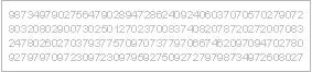
FIGURE 3 - Example of attentive processing.
The visual differences between the shapes of the various numbers that appear in Figure 3 (for instance, the difference in shape between a "3" and a "5") are too complex to process preattentively. To count all the 5's involves serial attentive processing. Now count the 5's in the same set of numbers in Figure 4.

FIGURE 4 - Example of preattentive processing.
This time perception was easy and immediate, because the 5's were encoded with a different preattentive visual attribute from the other numbers — in this case, a different color. Why is this important to note? Because if you want to visually encode information in a manner that can be perceived instantly and easily by your readers, you now know that you should visually encode the data using preattentive attributes, and if you want some of the data to stand out from the rest, you should encode it using different preattentive attributes.
Here's a list of the preattentive attributes that are of particular use in visual displays of data:
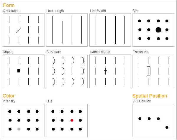
FIGURE 5 - Preattentive attributes of visual perception most applicable to data presentation.
These visual attributes aren't perceptually equal. Some are perceptually stronger than others. Some can be perceived quantitatively and can therefore be used to encode numeric values, and others can't. The graph in Figure 6 falsely assumes that quantitative values can be encoded as variations in hue.
Does intuition or even convention dictate that red equates to low values, black to mid-level values, and blue to high values? Even with the legend below the graph, which attempts to equate hues with quantitative values ranging from $6,848.70 at the low end to $419,867.24 at the high end (ignoring the inappropriate six decimal digits of precision), this graph is far too difficult to interpret. Only two of the preattentive attributes can be accurately used to encode quantitative values: 2-D location (for example, the location of data points in a scatter plot) and line length (for example, the length of a bar in a bar graph).
Color intensity, such as different shades of gray ranging from white to black (that is, "grayscale") can be quantitatively perceived to a degree — by making one value darker, for example, we can tell that it is greater than another — but not well enough to decode specific shades into specific values without a lot of work. An object's size, as in its 2-D area (simultaneous perception of both length and width), is another attribute that can be perceived quantitatively, in that we can tell that one object is bigger than another. However, it's difficult to determine by how much they differ. Our inability to reliably compare the sizes of 2-D areas makes pie charts difficult to interpret. It's hard to accurately compare the slices of a pie. It doesn't seem like it should be, but it is. Our ability to perceive differences in 2-D areas hasn't evolved to the same level of accuracy as our perception of differences in 2-D position, perhaps because it was more important for survival that our ancestors could detect the exact location of the saber-toothed tiger, rather than its exact size.
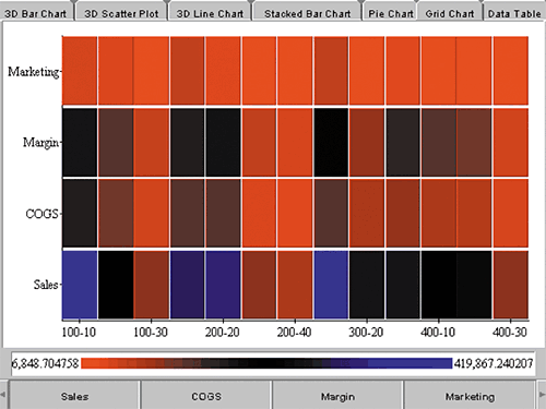
FIGURE 6 - Example of a misuse of hue for the display of quantitative values. (Notes: This is a screen capture of a graph that was constructed using interactive examples on Visualize's Web site.
Attributes that can't be perceived quantitatively can still be used in graphs, but their use is restricted to distinguishing categorical differences, such as the use of hue to distinguish different lines in a line graph, sets of bars in a bar graph, or sets of points in a scatter plot. Of these attributes, some convey stronger categorical distinctions than others. In Figure 7, which preattentive attribute does a better job of grouping the two data sets in the scatter plot: orientation on the left or hue on the right? They both work to a degree, but hue works better.
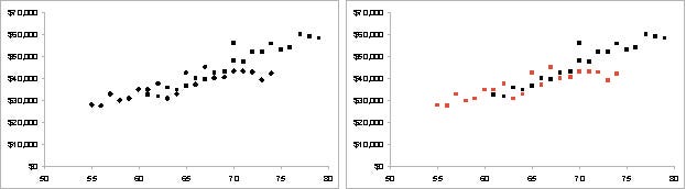
FIGURE 7 - Comparison of the relative strength of two preattentive attributes: orientation and hue.
Thriving With Information
The better you understand the strengths and weaknesses of visual perception, the better equipped you'll be to make use of your readers' abilities to detect structure and patterns in data when it's visually displayed. Edward R. Tufte, the foremost authority of visual data presentation, says:
"We thrive in information-thick worlds because of our marvelous and everyday capacities to select, edit, single out, structure, highlight, group, pair, merge, harmonize, synthesize, focus, organize, condense, reduce, boil down, choose, categorize, catalog, classify, list, abstract, scan, look into, idealize, isolate, discriminate, distinguish, screen, pigeonhole, pick over, sort, integrate, blend, inspect, filter, lump, skip, smooth, chunk, average, approximate, cluster, aggregate, outline, summarize, itemize, review, dip into, flit through, browse, glance into, leaf through, skim, refine, enumerate, glean, synopsize, winnow the wheat from the chaff, and separate the sheep from the goats.
"Visual displays rich with data are not only an appropriate and proper complement to human capabilities, but also such designs are frequently optimal."
What science has discovered about visual perception and the many ways that this knowledge can be applied to data presentation extends far beyond this article. I hope I've sparked enough interest to inspire you to study it further. According to William Wright (see Resources), "There is virtually unlimited freedom in how we represent data. The difficult question is how best to represent it."
Stephen Few is the founder of Perceptual Edge, a consulting firm that specializes in information design for analysis and communication. His new book, Show Me the Numbers: Designing Tables and Graphs to Enlighten, is now available from Analytics Press.
REFERENCES
|
About the Author(s)
You May Also Like
More Insights
Editor's Choice


May 2, 2024
While there are plentiful options in cyber resiliency and business continuity tools and platforms, there isn’t one that can knock out everything from sudden cloud outages to prolonged ransomware attacks in a single punch. What can you do to keep the company on its feet no matter what is thrown at it? Find out in this new virtual event.
Reserve Your Seat Now