News
Original reporting, exclusive interviews, and sharp analysis by experienced journalists. Coverage of the breaking and developing news that IT executives need to know about, like moves in the enterprise IT market, major cyberattacks, and more.
FBI Director Christopher Wray testifies during a Senate Intelligence Committee Hearing on worldwide threats on Capitol Hill in Washington, DC 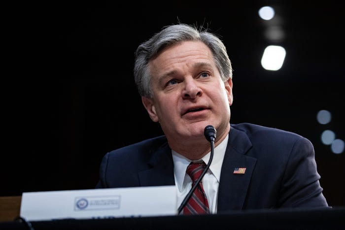
Cyber ResilienceThe Continuing Vulnerability of US Critical InfrastructureThe Continuing Vulnerability of US Critical Infrastructure
FBI Director Christopher Wray called for collaboration to protect critical infrastructure from Chinese government cyber threats.


.jpg?width=300&auto=webp&quality=80&disable=upscale "Protective Barrier To AI Technology as safety protocols and safeguards for artificial intelligence to mitigate risks associated with computer")


.jpg?width=300&auto=webp&quality=80&disable=upscale "Person holding cellphone with webpage of information technology company Accenture plc on screen with logo.")

Editor's Choice


May 2, 2024
While there are plentiful options in cyber resiliency and business continuity tools and platforms, there isn’t one that can knock out everything from sudden cloud outages to prolonged ransomware attacks in a single punch. What can you do to keep the company on its feet no matter what is thrown at it? Find out in this new virtual event.
Reserve Your Seat NowNever Miss a Beat: Get a snapshot of the issues affecting the IT industry straight to your inbox.