Visual BI Meets Pop Culture
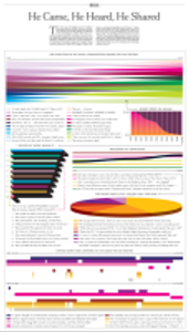
BI has crossed a cultural threshold. Data visualization forms have become a tool of pop culture. Witness a pseudo-infographic published in the <u>New York Times</u>. The BI forms are there, absent the usual, numerical BI content. "He Came, He Heard, He Shared" subverts familiar chart forms to deliver social/media commentary. It's <em>postmodern</em> BI...

BI has crossed a cultural threshold. Data visualization forms have become a tool of pop culture. Witness a pseudo-infographic published in the Arts & Leisure section of this last Sunday's New York Times. (The broadsheet page reduces surprisingly well to a computer screen.) The BI forms are there, absent the usual, numerical BI content. "He Came, He Heard, He Shared" subverts familiar graphics -- pie, line, and area charts, a horizontal bar chart, a pair of linked timeline charts -- to deliver social/media commentary. Artist and blogger Andrew Kuo substitutes qualitative text for numerical scales in using those BI forms to present personal commentary on music industry changes in the last ten years.Kuo "charts the way his experience of acquiring and enjoying music has changed along with the advent of iPods, MP3 blogs, iTunes, MySpace, streaming, Rapidshare, and Twitter." The set of text-loaded graphics -- Kuo would be thumbing his nose at BI best practices if he were interested in more than the forms -- is part of a narrative that connects his 1999 recollections with his perceptions of today's music world. In doing so, he making the connection, he offers an observation that aptly describes modern information dynamics: "Instead of finding information one step at a time, one record at a time, now it seems like the information finds you, from multiple and seemingly endless source."
Kuo's presentation is pure postmodern BI.
The postmodernism culture-theory label has been very widely applied in the decades since it was coined. When Andy Warhol turned repeated images of Brillo boxes into pop art, that was postmodernism. Same when architect Philip Johnson put a Chippendale top on the AT&T Building in New York. The effect is ugly, but you get the idea.
I like one particular (of several) definitions of "postmodern" offered by Martin Irvine of Georgetown University: "Artistic and stylistic eclecticism (hybridization of forms and genres, mixing styles of different cultures or time periods, de- and re-contextualizing styles in architecture, visual arts, literature)."
Elsewhere on his page, Irvine defines postmodernism as "pastiche and parody of multiple styles: old forms of 'content' become mere 'styles'." Doesn't this describe well what Kuo creates in "He Came, He Heard, He Shared" by recycling BI graphical styles, devoid of (traditional) numerical-analytical content?
My theorizing here isn't going to help you with your Qlikview/Tableau/TIBCO Spotfire visual BI evaluation, nor in shaking loose a bigger BI budget from your company's CIO. All the same, I hope this quick look at what Andrew Kuo did with our tools -- his choice of different styles for different types of information, how he used graphics to weave a story from a variety of data points/threads -- will help you see ways you can use visual BI forms just a bit more effectively to tell your own stories with visual BI.BI has crossed a cultural threshold. Data visualization forms have become a tool of pop culture. Witness a pseudo-infographic published in the New York Times. The BI forms are there, absent the usual, numerical BI content. "He Came, He Heard, He Shared" subverts familiar chart forms to deliver social/media commentary. It's postmodern BI...
About the Author
You May Also Like


