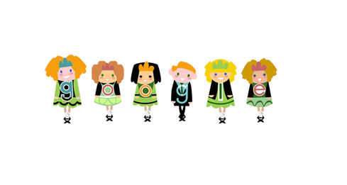
Google Logo Gets Mobile Makeover
Google has swapped out its old logo in favor of a simpler design optimized for a broader range of devices.


10 Google Doodles You've Missed
10 Google Doodles You've Missed (Click image for larger view and slideshow.)
If you've been on Google in the last few hours, you've likely already noticed the minor change that's making major headlines.
Google's iconic logo has gotten yet another makeover, the company announced on Sept. 1. You can see its old familiar banner on the homepage, but it's quickly erased and rewritten in a new format.
The search giant opted to keep its red/yellow/green/blue color scheme, but trade its old serif font for a simpler-looking sans-serif font designed by Google. Its formerly blue "g" has been replaced with a "G" that includes all four colors.
[Google Self-Driving Car Prototype Arrives in Austin]
The logo change is intended to reflect Google's ongoing evolution. At the time it was founded, Google was created as a search engine for desktop PCs. These days, Google interaction spans smartphones, tablets, smartwatches, and occasionally desktops.
As a result, the logo has been redesigned for optimization on smaller devices and "a world of seamless computing," wrote vice president of product management Tamar Yehoshua and director of user experience Bobby Nath.
Users typically have several devices and enter information differently on each one.
"It doesn't simply tell you that you're using Google, but also shows you how Google is working for you," they explain. "For example, new elements like a colorful Google mic help you identify and interact with Google whether you're talking, tapping or typing."
The logo transforms into a series of animated dots during a voice search, and then turns back into "Google" when results are displayed. This change is the sixth since the company was created. It marks Google's biggest logo transformation in 16 years, as well as a change of brand identity.
The trend of adopting simpler design is a growing trend among tech companies; both Facebook and Twitter have announced similar changes in recent year. Officials note we'll see Google's new design appear across products soon, but this "probably won't be the last time" it gets a makeover.
Google's new logo is the latest in a series of announcements highlighting changes in Mountain View. Less than one month ago we learned about the creation of Alphabet, the parent company under which Google and its subsidiaries will be reorganized.
Larry Page will serve as CEO of Alphabet; Sergey Brin will be president. The two will narrow their focus on Google X, the division for supporting the growth of research projects like the self-driving car and drone deliveries.
Google, headed by former senior vice president of products Sundar Pichai, will house services including search, maps, apps, ads, Android, YouTube, and all related technical infrastructure.
Other recent news from Google includes the release of its OnHub router, a partnership with Sanofi to improve diabetes treatment, a new service for launching and managing Docker containers, and the availability of Android One in Africa.
About the Author
You May Also Like


