Eenie, Meenie, Minie, Moe: Selecting the Right Graph for Your Message
What's the right graph for your BI message? You can't make this an arbitrary decision; the success of your data presentation hangs in the balance. Here are practical ideas that will help you remove the guesswork.

This series on effective data presentation is about building a solid conceptual foundation for all of your presentations (see Resources). Although the number of possible messages is without limit, the universe of quantitative messages (the focus of this article) can be boiled down to seven quantitative message types. By simply identifying the message type and knowing the proper design solutions that correspond to that type, you'll be able to conquer most of your design choices. In other words, you'll apply a few general principles to countless specific data presentation challenges.
Almost every situation you'll encounter when presenting typical business information can be addressed using these seven quantitative message types. (Of course, you might encounter unique data presentation challenges in the specialized aspects of a particular business or in the scientific community. This article focuses on solutions for the data you'll encounter regularly across all businesses, regardless of industry.)
Before listing and describing these seven quantitative message types, however, I need to introduce two preparatory concepts: the difference between quantitative and categorical data, and the visual objects that can be used to encode quantitative values in graphs, including their differing strengths.
Quantitative and Categorical Data
Messages that involve quantitative data — the numbers that measure things — always include related categorical data as well. Categorical data identifies what the numbers measure: "Are these numbers measuring the productivity of individual employees, sales within regions, or shipments per day?" In a graph, categorical data appears as the text labels for the numeric values that appear in the space bounded by the axes. Simply put, categorical data tells us what and quantitative data tells us how much. Quantitative data without related categorical data is useless.
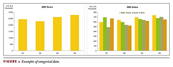
Categorical data sets consist of multiple items — subdivisions of the category. A region category might consist of north, south, east, and west. A time category might consist of the individual months of a year. A graph can include more than one set of categorical data. Take a moment to look at the two graphs in Figure 1 and count the number of categorical data sets in each.

The graph on the left has a single set of categorical data: time, subdivided into four quarters. The graph on the right has two sets of categorical data: time, subdivided into four quarters as on the left, and regions, subdivided into north, east, south, and west.
Whatever the category and its subdivisions, it is one of three types based on how the individual category subdivisions relate to one another. The three types are:
Nominal
Ordinal
Interval.
Just as we use the term scale to refer to the range of quantitative values that appear along an axis in a graph, we also refer to a set of categorical items arranged along an axis as a scale. Graphs always include at least one quantitative scale and almost always include one or more categorical scales, although I'll point out an exception a little later.
A nominal scale has no intrinsic order. Is there an intrinsic sequence to these departments: sales, operations, finance, human resources, and IT? You might list the departments of your company in a particular sequence based on convention, but the list has no particular inherent order. The term nominal — "in name only" — suggests a set of items with different names, but no particular relationship to one another.
In contrast, an ordinal scale has an intrinsic order. The terms "ordinal" and "order" are semantic siblings. Perhaps the simplest categorical scale of the ordinal type is first, second, third, and so on. These categorical labels have a definite order; to list them out of sequence would create confusion. Ask yourself: "What categorical scale of an ordinal type appears more often than any other in business reporting?" Got it? It's the categorical scale of time. Dates and times, regardless of grain (centuries, decades, years, quarters, months, weeks, days, hours, minutes, or seconds), possess an intrinsic order. To arrange them out of order wouldn't make sense.
An interval scale is the result of a conversion from a quantitative scale. Sometimes it's useful to subdivide a range of numeric values into a set of smaller ranges (intervals) and give each range a categorical label. Let's say you want to count the number of employees in your company by age in years, but you don't want to report a separate count for every individual age represented in the full population of 1,000 employees. One solution is to subdivide the full range into six smaller ranges labeled "20-29," "30-39," "40-49," "50-59," "60-69," and "70-79."
You must handle interval scales with great care. If you handle them incorrectly, you'll unintentionally alter the presentation of the data, resulting in misinformation. The most common mistake that people make when working with interval scales is to subdivide the scale into unequal intervals. Figure 2 illustrates three of the many possible ways that ages ranging from 20 to 79 can be converted into interval scales: The graph on the left consists of equal intervals and the other two show unequal intervals. As you can see, the message presented by each of these interval scales is quite different.

Understanding the distinction between quantitative and categorical data and between the three types of categorical scales will come in handy when you work with graphs. The principles of effective visual design as applied to graphs differ between quantitative and categorical data. Also, rules for how you should and shouldn't arrange data in a graph differ between nominal, ordinal, and interval scales.
Encoding Quantitative Data
In "Tapping the Power of Visual Perception" (Sept. 4, 2004), I described a set of visual attributes, called preattentive attributes, which combine to form what we perceive as objects. These attributes include 2-D location, line length, size, shape, orientation, and color. You can use these attributes to encode and differentiate quantitative values and categorical items. Of the full list of these attributes, only two emerge as highly effective means to visually encode quantitative values: 2-D location and line length. Figure 3 includes three graphs to illustrate how these two attributes can encode quantitative values.

All three graphs have the same quantitative scale along the vertical axis and the same categorical scale along the horizontal axis. The graph on the left uses simple points — in this case dots — to encode the quantitative values. Each point aligns with a value along the quantitative scale on the vertical axis using 2-D location to encode its value. The middle graph also uses 2-D location to encode quantitative values, but in this case a line is added to connect the dots. In the graph on the right, vertical bars are used to encode quantitative values. In this case, however, both 2-D location, based on the endpoints of the bars, and line length, based on the length of the bars, are used to encode the quantitative values.
The graphs in Figure 3 not only illustrate how the two attributes, 2-D location and line length, are used to encode quantitative values, but they also display the three types of objects that work most effectively to encode quantitative values: points, lines, and bars. Each type has its own strengths and weaknesses as encoders of quantitative data, and each can be the best choice for communicating particular quantitative messages.
Points, which can take the form of any simple geometrical shape, such as circles (or dots), dashes, squares, triangles, and so on, visually emphasize the individual values that they encode. Points are rarely used in graphs by themselves, but are more commonly used in combination with a line that connects them, except when they appear in the type of graph called a scatter plot. A scatter plot is that one exception to the norm of having at least one categorical scale in a graph. In its simplest and most useful form, a scatter plot has two axes — one vertical and one horizontal — and both display quantitative scales. 2-D scatter plots (those with two axes) display the correlation between two paired sets of quantitative values, such as the relationship between years of education and salary across a sample population of people. When both axes represent a quantitative scale, you can't use lines or bars to encode the data: only a point, with negligible height and width, can be used to encode the intersection of two quantitative scales, such as an education level of 18 years along the vertical scale and a salary of $132,000 along the horizontal scale. Other than in scatter plots, points are rarely used alone to encode quantitative values in graphs because they lack the visual weight needed to clearly reveal the data's overall shape.
Lines are used in two ways to encode quantitative data in graphs:
To connect a series of individual data points
To display the trend of a series of data points.
Lines do a great job of showing the shape of data as it flows and changes from point to point. Lines are especially useful for showing the movement of values up and down through time, with a clear representation of change from point to point. Lines reveal patterns that might not otherwise be visible, such as a clear deviation in sales from the norm in a particular month, or the way that sales jump dramatically at the end of each quarter. Also, when you have many individual values in a graph, it's often difficult to discern the overall trend of those values, but a simple trend line can bring it into sharp focus.
Bars are the visual heavyweights of this group. By combining the two attributes of 2-D location and line length to encode quantitative values, bars emphasize the individual values of the thing being measured per categorical subdivision, such as expenses for a series of individual departments or regions. Because they grant such visual weight to the individual values, they're not as good as lines at showing the pattern of data as it flows through time, but when you want to focus attention primarily on individual values and support the comparison of one to another, bars do the job superbly.
At this point, you might be protesting that I've excluded the use of other visual attributes such as size and color for quantitative encoding. You're quite right, and this omission is quite intentional. Although variations in the size of data points (such as circles of different sizes) or in their colors (such as a range from light to dark) may be used to encode quantitative values — especially when you've already used 2-D location and line length for a different measure — size and color are much less effective. You can tell that one circle is bigger than another or that one is darker than another, but it's difficult to tell by how much. Using size or color to represent quantitative values results in a visual puzzle that's very difficult for most people to interpret.
Now that I've presented the topics of quantitative vs. categorical data and the best means to encode quantitative values in graphs, you have the conceptual foundation necessary to get back to the main topic: the primary types of quantitative messages and how to graph them.
And Then There Were Seven
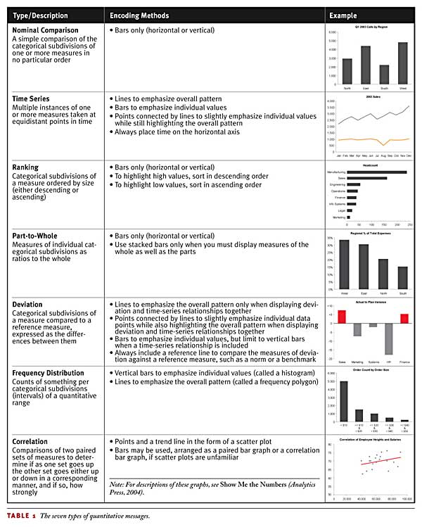
The seven types of quantitative messages differ in how separate values relate to one another. Quantitative messages always reveal relationships, and it's these relationships that tell the great stories that deserve attention. Almost every quantitative message that you'll ever need to present in a graph can be described as one or as a combination of more than one of the seven types in the following list (in no particular order):
Nominal comparison
Time-series
Ranking
Part-to-whole
Deviation
Frequency distribution
Correlation.
Table 1 describes each of these seven quantitative relationships and also identifies the best ways to encode their values. Knowing what you do now about the relative strengths and weaknesses of points, lines, and bars for encoding values, try determining which objects would work best before looking at the encoding method guidelines that I provide.

By understanding these seven types of quantitative relationships and the graphical methods that present them most effectively, you've already won half the battle. Knowing the best means to present data is the first big step; knowing how to design the separate components of a graph to communicate your message clearly, powerfully, and without distraction is the other big step, which we'll examine in the next article of this series.
Stephen Few is the founder of Perceptual Edge [www.perceptualedge.com], a consulting firm that specializes in information design for insight and communication.
Resources
Part One: "The Information Cannot Speak for Itself"
July 10, 2004
Part Two: "Common Mistakes in Data Presentation"
Aug. 7, 2004
Part Three: "Tapping the Power of Visual Perception"
Sept. 4, 2004
About the Author
You May Also Like


