Samsung Designer Defends Copycat Icons In Apple Case
Samsung designer says she picked phone, clock, and camera icons because they worked, not because they looked like Apple's iPhone icons.


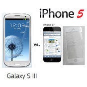
Apple iPhone 5 Vs. Samsung Galaxy S III: What We Know
Apple iPhone 5 Vs. Samsung Galaxy S III: What We Know (click image for larger view and for slideshow)
In a day filled with attorneys' maneuvering, Samsung on Tuesday attempted to put a human face on its defense that it didn't infringe Apple's patents. The face was that of a thirty-ish Korean designer and mother, Leeyuen Wang, who had just given birth to her first child as Samsung mounted its intensive push in 2010 to counter the incursions Apple was making into the smart phone market.
Wang is a senior designer at Samsung and her job title now includes creative director. Taking the stand in black pants, black blouse, and a pleated-in-the-back, lapels-in-front, pink business jacket, she presented a striking figure as Samsung's lead icon designer. She had to speak through an interpreter, but she sat dignified and erect, sure of herself in the unfamiliar setting of a U.S. District Court room.
Previously, the members of the Korean design team had lacked any real substance. The chief strategy officer of Samsung Telecommunications America, Justin Denison, was its main representative. He was a responsible voice but it was clear he hadn't spent much time at company headquarters and was primarily associated with the U.S.-based STA business unit, a portrayal that distanced him from Samsung's design team in Seoul and Gumi, Korea.
Apple's early witnesses, designer Christopher Stringer, who told the court how hard his team had worked on the iPhone and iPad designs, and VP of iOS software, Phil Schiller, had both rubbed elbows with Steve Jobs. Samsung had no equivalent star to put on the stand, but it was finally backing up its claims Tuesday with a qualified design person. Wang has been nominated for designer of the year at Samsung and will receive a multi-million dollar price if she wins.
After establishing credentials, Samsung attorney John Quinn immediately asked her: "Did you copy the layout of the Apple application menu page?"
[ Legal problems are not slowing down Samsung. Read Mobile Sales Slip, But Samsung Sales Push Android. ]
"No, not at all," Wang said.
Quinn asked what it was like to work for Samsung on the Galaxy line of phones.
"Samsung is a company that is very tough to work at. It's a very hard working company. When we developed the Galaxy S 1, we had hundreds of people" in different design disciplines from other Korean cities work together in Seoul. "We all had to come together, work together for three months," she said.
"I seldom got more than two or three hours of sleep a night," she added. The period included added stress as it kept her at work and separated her from her newborn. She attempted to save breast milk for the child to drink in her absence "but breast feeding had to come to a stop because I wasn't able to give milk any longer," she recalled. "It was very hard work, difficult times."
Quinn asked her why smart phone icons often appear similar across various brands.
Wang responded that the same rules of good icon creation apply to all manufacturers. "The user should be able to recognize it right away," she said. The symbol selected must have meaning without being complicated. At the same time, symbols by themselves are too small, once crowded together, to be sure that the user will touch the right one. To lessen the imprecision of typical touch operation, the icon symbols are surrounded by squares with a background color; the squares with rounded corners are as sensitive for invoking the desired application as the symbols themselves. Another way of differentiating icons is through color.
Why did you select a phone icon for the smart phone's calling function? Quinn asked.
What better way to match the function desired than with a symbol of what the caller will use to achieve his goal. The Galaxy's phone icon, clock icon, and camera icon are all symbols of the physical devices used to achieve the desired function, she said.
Quinn pointed out that the phone icon on the Galaxy is very similar to the phone symbol on the Apple iPhone, with a green background.
Picturing a phone as it would be held in the hand in answering a call is a very natural way of portraying the calling function on a smart phone, Wang explained. Both Samsung and Apple use a green background for the telephone handset symbol.
"Green had a positive connotation--go, do it, make the call," Wang responded. Red can be used for the opposite in representing some applications--don't go or stop, she said. Her design team calls such icons "dumbbell icons."

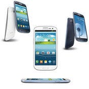
Samsung's Android Super Smartphone: Galaxy SIII
Samsung's Android Super Smartphone: Galaxy SIII (click image for larger view and for slideshow)
Wang said Samsung designers tried quite a few icons. It tried a smart phone as the symbol for phone calling function and gradually settled on the phone set, a clock, and a camera as the only possible, logical choices. Wang said she personally decided on those images for icons after experimenting with others.
"What was your experience?" Quinn asked. "We tried quite a few," Wang said, but they didn't work as well as the simplest, best recognized symbols. Her team calls them dumbbells because little has to be done with them; they just work. Quinn first heard the response as Ma Bell icons. The phone handset was originally created by AT&T for use on public phone booths in the 1930s and a Samsung lawyer several days earlier had branded it the Ma Bell icon.
Apple had charged in its opening statement that it uses a yellow sunflower as its photo gallery icon and the Galaxy phone's yellow flower is copied from it. But Wang claimed there is wall paper at the company headquarters with the flower that she and other people in the company liked. A slide of a close up of the wall paper was shown and Wang illustrated what had determined what part of the flower they used for their gallery icon.
For just a minute, the Apple vs. Samsung case turned into the Apple and Intel vs. Samsung case. An Intel lawyer showed up to protest because a Samsung expert witness, Tim Williams, was going to show Intel source code. The showing had been previously agreed to, but Williams had failed to disclose all of his potential conflicts, if he gave the testimony, due to past work with other companies. Williams uncomfortably stood before Judge Lucy Koh, who asked him why he hadn't disclosed all past connections.
Williams said it was because he was under non-disclosure agreements with some companies. Apple's attorney Michael Jacobs was not impressed and protested that they had just received notice that some of Williams' connections had not been aired when he was deposed several months ago.
At that point Samsung attorney Charles Verhoeven intervened to say that, "Intel is allied with Apple in this case. This may be an ambush," to knock a Samsung witness out of the proceedings. Intel is understood to be sympathetic to Apple, a major customer for its Xeon chips in the Macintosh and other devices. Samsung, in contrast, is a component competitor that supplies logic processors for smartphones. Apple attorney Harold McElhinny joined the fray as well.
The dispute didn't sit well with the judge, who is routinely bombarded after hours with motions from both sides to strike evidence, bar witnesses, and rule on admissibility of documents as the two sides maneuver for the smallest of advantages.
As the attorneys debated with some heat, the judge bore down on the disputants. "I want to see papers, I don't trust what any lawyer tells me in this courtroom," she said. Both sides must argue their case in briefs.
Not every encounter was acrimonious. Howard Mintz, the San Jose Mercury News staffer who has been copiously live blogging the trial, quoted Jacobs last week as saying the opposition's exhibit was "like parrots to apricots." The barrister meant an inappropriate comparison had been made but maybe the exhibit wasn't that bad. In the hallway outside the courtroom, Jacobs and Mintz had a laugh over what had actually been said: "like pears to apricots."
Forbes writer Connie Guglielmo, passing the dean of the Apple attorneys, Bill Lee, on her way out of the courtroom, thanked him for quoting her second day story on how Samsung's Quinn's release of documents to the press July 31 that he didn't get into evidence. Lee had cited a press report saying the move "flouted" the judge's intent as she refused to admit Quinn's document as evidence. Guglielmo was the author of "flouted."
About the Author
You May Also Like


