Clustering: Knowing Which Birds Flock Together
Analytics pros from many different industries employ clustering when classification is unclear. Here's how they do it.

Imagine a jigsaw puzzle. Usually you can associate pieces by image and shape. But suppose every piece is the same shape and is small enough to make images confusing at first look. You'd take a guess at how they fit, right?
Data can be that way. Fortunately, analysts are finding many advanced ways to bring data together. One technique receiving attention these days is clustering, an unsupervised machine learning method that calculates how unlabeled data should be grouped.
Clustering has been used in different industries and studies when classification is unclear. Medical researchers, for example, use clustering to associate patients with similar symptoms or results to clinical trials. Marketers in particular value clustering for discovering customer groups based on unlabeled data. In this instance, we will look at how preparing for clustering is done.
To run a cluster analysis, you can use some basic R programming or Python programming steps. Python is pretty straight-forward in its application, while R relies on libraries, a set of functions that run specialized functions within a program.
Once you have chosen your programming language, you can then import data in your program via a local file or an API call to a database. Most developers have worked on libraries or python frameworks to make API calls easy.
The data is placed into an object. Doing so allows you to inspect the data and ensure it is without anomalies. Both R and Python rely on objects to place data in a matrix format, which allows for mapping data to graphs easily.
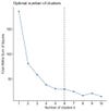
The next step is creating a cluster to examine a few statistical details, with the purpose of determining the number of observations in each cluster and seeing how observations are matched to the clusters. The most valuable result is being able to plot the sum of squared error (SSE) versus potential K-mean values. SSE is a sum of the squared difference between an observation value and a mean of the observations. Its purpose is to measure the accuracy of the clusters -- a low number implies less variation in the results.
Analysts strive to creates a curve that the analyst then follows with a decreasing SSE until reaching an "elbow" that represents the recommended K-means values.
As an example, below is a SSE/K-means graph I created in R using the library factoextra. In this example, 6 is selected as the K-means.

The analysis is then recalculated to get the cluster details with K-means set equal to 6.
From an analytics perspective, how data is processed in clustering differs from a straightforward label seen in analytics solutions. Imagine how analysts have typically reported -- they've explained a result based on how data is arranged in a metrics and dimensions, such as the largest sources of referral traffic or the keyword phrases that brought the largest search traffic.
With clustering, the data is not set in a pre-arranged relationship. There's no response variable -- the dimension dependent on metrics. The cluster algorithm examines the dataset, and then arranges the partitioning rules based on the data parameters.
Advanced tools like SAS Visual Analytics and SAS Visual Statistics can provide additional insights on clustering results. These tools, for example, can highlight if a correlation among some clusters exists. That can aid decisions on how to treat customer segments represented by the clusters determined.
There are a number of ways to determine clusters, along with examining the correlation between cluster groups. K-means is the most commonly used technique when starting a cluster analysis. But other types of clusters exist, such as hierarchal, which processes each observation so that the results are mapped out as a hierarchy rather than data point grouped together.
The selection of an analysis technique depends upon the assumptions you place on the data. A good choice depends upon appreciating the math being applied in a program and translating the data assumptions into the programming language you use.
But overall, there is no one single playbook. That open sky opportunity is the best benefit cluster analysis offers. Unlabeled data sparks creativity in finding data patterns. Clustering can ultimately provide new views of product, service, and customer segments and make delivering solutions to those segments less of an enigma.
About the Author
You May Also Like


