Urban Observatory Maps Comparisons Between Cities
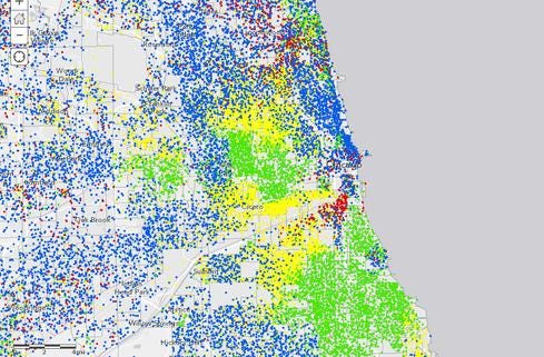
Urban data map, bound for the Smithsonian by way of Esri's user conference, was created in partnership with Richard Saul Wurman, architect, graphic designer, and founder of the TED conference.


Government Data + Maps: 10 Great Examples
Government Data + Maps: 10 Great Examples (Click image for larger view and slideshow.)
The Urban Observatory is the big-data telescope for the urban planner, the business leader working on site selection for that next store or factory, or anyone curious about how different cities stack up in comparison to each other.
A new version will be unveiled next week at the Esri user conference, the same venue where it was first shown a year ago. This edition is also bound for the Smithsonian Institution, where it will be the basis of an exhibit to be introduced at the renovated Smithsonian Castle in Washington, in February 2015. The updated Web app version is available online at urbanobservatory.org.
"The first one caused quite a sensation initially, but looking back I would call it a prototype," Esri CEO Jack Dangermond says. The first version covered 10 cities. The latest one presents data on more than 50 cities and for a much greater number of variables.
[The world online: UN Studies Social Data For Global Pulse.]
The Urban Observatory is a collaboration between Esri and Richard Saul Wurman (best known as founder of the TED conference and TEDMED), with design by RadicalMedia.
A polymath, Wurman is an architect and graphic designer by training, but also coined the term "information architect" for someone who organizes information. One of the primary technical goals of the project has been not only to visualize data, but get it into truly comparable terms -- something that is much more challenging than it might seem, Wurman explains.
"No two cities do maps to same scale, using the same legends," he says. On different maps and in different statistical digests, an airport might be labeled commercial, industrial, or transportation, for example, making it difficult to compare the amount of community property use between cities accurately. "Many think this has already been done. I've spent several years working on this proof-of-concept showing that it has not been done." Wurman took his first cut at systematically comparing cities back in 1962, using clay models, as part of a book on urbanization. His goal remains the same, but now with a digital approach to modeling, he says.
Understanding the dynamics of cities grows more important every day, he says. The Global Health Observatory projects that by 2050 seven out of ten people will live in a city. The Urban Observatory takes advantage of a standardized language for expressing facts about cities developed by Wurman. Any city that would like to participate is invited to submit its data in that format.
Dangermond said the computer model has been designed to tolerate some gaps -- for example, not every city has provided information on an index such as "walkability" -- so comparisons might not be available in those cases. Still, if you want to see how many parks there are in New York, versus Los Angeles, versus Paris, you can compare.
Or you might compare the distribution of older people between any American city and Tokyo, Dangermond noted by way of example, which will show how senior populations tend to be concentrated in pockets within the US. "In Tokyo, you can see the senior population is distributed evenly throughout the city because in Japan the model is that old people live with their children as they age," he says.
Dangermond called the technique used to create the model "authoritative-source crowdsourcing," meaning data is gathered from many sources -- only authoritative ones rather than the general public. The visualizations were created with the ArcGIS Online, Esri's platform for collaborating on and publishing geographic information.
One of Wurman's principles for information architecture is that the best way to understand something is to compare it with something you already understand. Thus, the best way for a New Yorker to understand Paris is by direct comparisons with New York. Understanding geographic and special concepts works the same way. "You don't know what an acre is until you compare it with something. You can look up and see that it's 43,560 square feet, but that won't really mean anything to you. But if I tell you it's about the size of an American football field without the end zones, then I've compared it with something you know," he says.
The version to be installed at the Smithsonian is envisioned as including many tabletop displays for exploration by museum goers, as well as a large wall-mounted display. Because it is backed by cloud software and data, "It's a new kind of exhibit that can be added to," he says, developing over time as cities and data points are added.
The project was born as much as anything out of a friendship between Dangermond and Wurman, the two men said. "Both Saul and I believe in it," Dangermond said. "It's not just to show off the technology. It's research work that needs to be done."
InformationWeek's June Must Reads is a compendium of our best recent coverage of big data. Find out one CIO's take on what's driving big data, key points on platform considerations, why a recent White House report on the topic has earned praise and skepticism, and much more.
About the Author
You May Also Like


