Baton Rouge Flood Map: Using IT Know-How In Emergency Situations
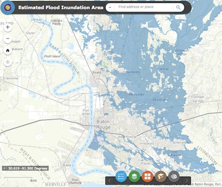
The Department of Information Services in Baton Rouge used geographic information systems and data from 911 calls, search-and-rescue efforts, and more to create a map visualization of the impact of recent floods in the region. The story is a prime example of how IT professionals can put their knowledge to work in emergency situations.


10 Data Visualization Tools To Bring Analytics Into Focus
10 Data Visualization Tools To Bring Analytics Into Focus (Click image for larger view and slideshow.)
Anyone looking for a view of the historic flooding in Baton Rouge, La., probably has seen the map created by Warren Kron and his team. Kron is GIS Manager in the IT department of the City of Baton Rouge and the Parish of East Baton Rouge. He's charged with working with geographic information systems (GIS) within the greater framework of IT. The goal? To help government services such as law enforcement and emergency personnel function effectively and to provide more comprehensive visual information services to residents.
For example, Kron's GIS work as part of the government of Baton Rouge includes creating applications to help people identify their council district based on the street address of their house.
[Looking for more government-created GIS data-driven maps? Read Government Data + Maps = 10 Great Examples.]
Kron's highest profile project to date has been the map he created using a variety of GIS data, along with tools from geographic information system vendor ESRI, to simulate a view of the disastrous flooding that took place earlier this month in Baton Rouge and other Louisiana cities and towns.
Connecting data from multiple sources, including 911 calls, search-and-rescue data from the fire department, 311 non-emergency calls to the government, and other information, Kron and his team were able to use ESRI software and cloud-based ArcGIS software to create a multiple-layer map that visually simulates areas worst hit by flooding.
Creating the map was a multi-day process that started on August 14. At that point, Kron only had data from a few hundred 911 calls.
"We used these few hundred data points to see if there was a trend," he told InformationWeek in an interview. "If there was an obvious clustering of points, we shaded that area and assumed that this area was flooded. The only problem was that this first version of the map grossly underestimated how much of our parish had flooded."
A few days later, Kron received access to addtional geographic data that helped improve the accuracy of his maps. For instance, Kron received all search-and-rescue data to plot on the map. Then he received access to the 311 data -- non-emergency calls to the government to report problems such as sewer backups.
His team also layered on information from FEMA about special flood hazard zones. "We assumed those areas were flooded," he said. The map evolved as Kron layered each of these new sources of GIS data to create an accurate picture.
Then his department did something else. It released the map to the public via the city government's website and used the government's Facebook and Twitter feeds to promote it. The postings asked the public to provide feedback -- and to let government officials know if anything was missing.
"My phone has turned into a hotline," Kron said. "And we have a generic email address where people are sending us information. Over Monday and Tuesday [Aug. 22-23], we reached over 100,000 people through Facebook. It went crazy."
Local newspaper The Advocate included an embedded version of the map as part of its online coverage of the flood.
A week after its August 18 debut, Kron's map, called Estimated Flood Inundation Map, had already received 60,000 page views on the government's website.
"I didn't know the map would be so popular," Kron said. He soon received word about an ESRI user in Australia who was trying to view the map and said it wasn't loading properly.
"I realized that my GIS server was not going to be able to handle the number of requests. We decided to move it to the ArcGIS Server online." ArcGIS, an online map platform from ESRI, was designed and equipped to handle spikes in traffic.
Kron's map now compiles mulitple streams of data, including:
911 calls
The Baton Rouge Fire Department's search-and-rescue data
311 requests
Street-level damage assessments from city and parish staff and other public officials
Debris collection routes
Road closure information
NOAA images
Civil Air Patrol images
FEMA DFIRM flood hazard areas
Plus, the map now includes comments from the general public via social media and email to provide clarification when needed.
About the Author
You May Also Like


